
How to organize a Pokémon binder by color
Sorting by set number is tidy. Sorting by color is what makes people stop and flip back a page. Here's the way I build color pages, from an empty binder to a finished spread.
1. Start with one card you love
Every good color page I've made started with a single card that set the mood. Maybe it's a sunset illustration rare, or a dark full art you keep pulling out of the box to look at. That card decides the palette for the whole page, so pick it first and build around it. Don't start from "I want a blue page". Start from "I want a page that feels like this card".
Look at the whole artwork, not just the Pokémon. A Water type can sit in a warm orange scene, and a Fire type can be drawn at night. The background usually takes up more of the card than the Pokémon does, so it matters more for how the page looks.
2. Name the page
Giving a page a name sounds silly, but it keeps you honest when you're choosing cards. "Reef", "Night", "Sunny City" and "Vibrant Forest" are four of mine (they're further down this page). With a name, it's easy to tell when a card doesn't belong, even if the color is technically close. A green card set in a city doesn't belong on a forest page.
3. Find cards that fit
This is the slow part if you do it by hand. A few ways to speed it up:
- Search by color instead of by name. In Binder Lab's card search you can filter by main color, pattern and art style, so you can ask for "orange, illustration rare" and get a short list instead of scrolling through whole sets.
- Describe it. Smart search takes a sentence like "underwater scene with coral" and finds cards whose artwork matches.
- Let it fill the gaps. Once a page has a few cards, Fill page suggests cards for the empty pockets that match the colors already there.
- Use "similar cards". Open any card and scroll down. Similar cards shows matches by artist, art style and color, which is often how you find the second and third card for a theme.
4. Put the page in order
A page of the right colors in a random order still looks busy. What makes a page look finished is a gradient: the colors move smoothly from one corner to the other. The usual orders are:
- Row by row: light to dark, reading left to right and then top to bottom. Good for pages with one main color in different shades.
- Diagonal: one color in the top-left corner fading to another in the bottom-right. Good for two-color pages like sunset orange into purple.
- Center out: the strongest card in the middle pocket, softer cards around it. Good when one card is clearly the star.
Binder Lab's Reorder button does this for you. It reads the colors in each card's artwork and sorts the page into a gradient, and you can still drag cards around afterwards if you want something else in the middle.
5. Look at the spread, not just the page
In a real binder you see two pages at once. Two warm pages side by side can blur together, and a warm page next to a cool one makes both stand out. Turn on Spread view to see pages in pairs, and swap whole pages around until each pair looks right.
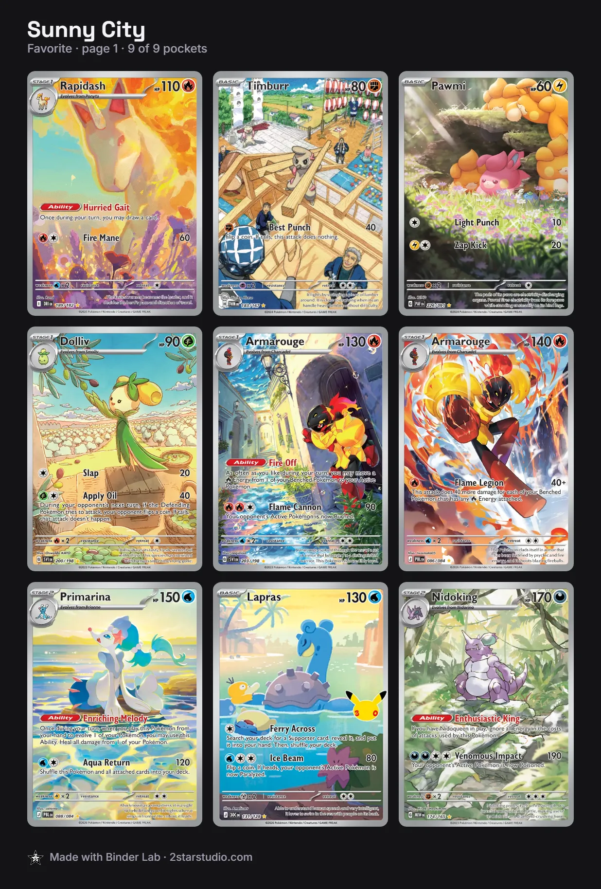
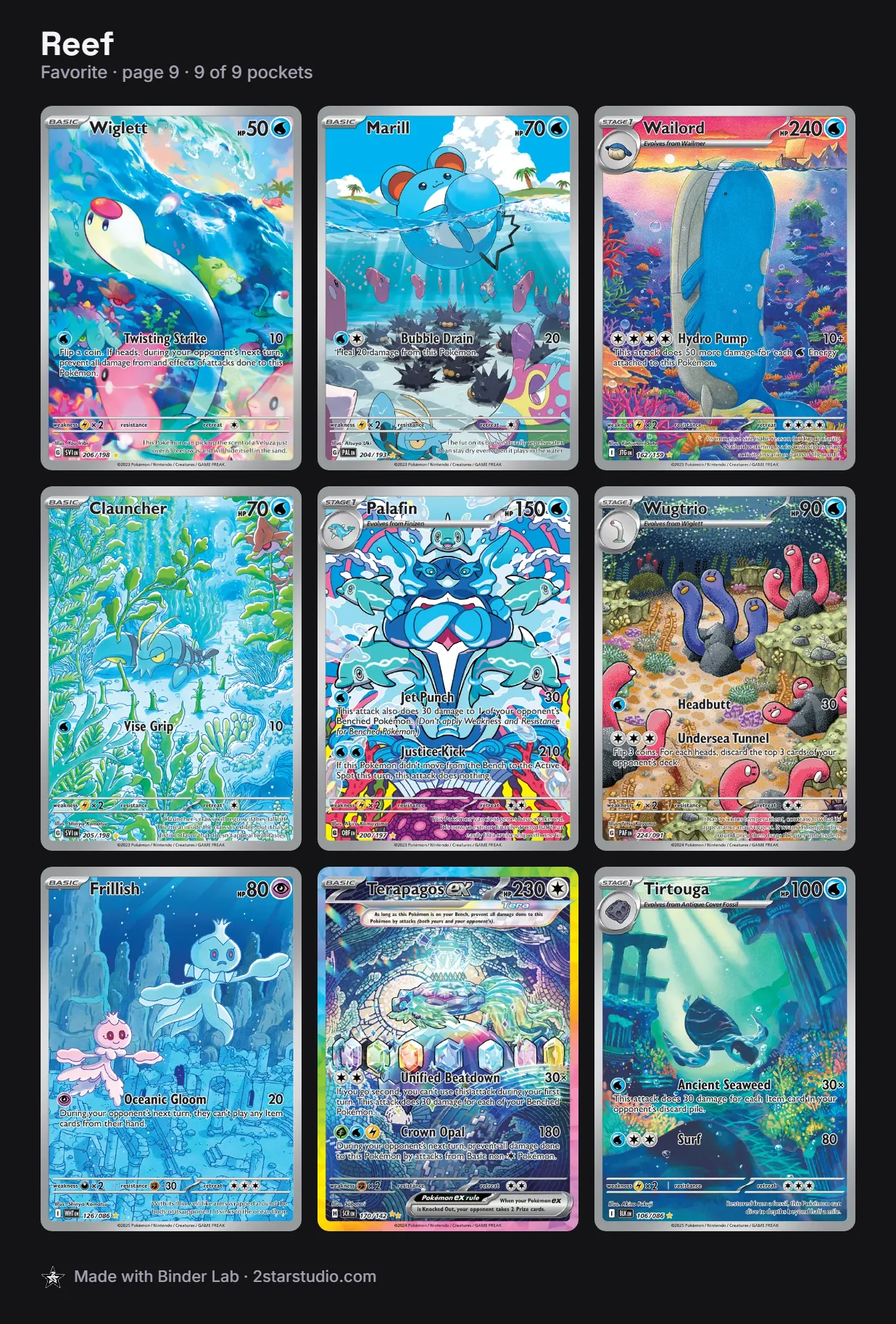
6. Track what you still need
Most color pages have a few pockets waiting on a card you don't own yet. Plan the page with the card in place anyway and mark it as missing. You'll see the finished page right away, and you'll have a shopping list. With prices turned on, the page also shows what it would cost to finish.